Creating Web Pages With Purpose

I've been talking about how I kick off new projects in this series. The first post was about understanding customers using user personas. Next was how to create a flow that allowed customers to move effortlessly through your site.
In this post, I'll be showing you the process I go through to create wireframes. I cover what they are, why you use them and how they help each page have the right structure. Wireframes have helped get feedback early in the design process, saving time further down the line where it can be costly.
What Are Wireframes?
At first glance, a wireframe looks like a group of boxes on a page. (This is not a million miles away in the early stages).
A wireframe shows the structure of a page; it's a way of showing the hierarchy of a screen in a straightforward and simple-to-digest format. Wireframes are often created by using boxes and labels to represent different elements of the app or website.
“Wireframing is a way to design a website service at the structural level.”
— EXPERIENCE UK
experienceux.co.uk/faqs/what-is-wireframing/
Keeping a wireframe visually simple helps keep the attention on the structure and content of each screen in your website or app. It also has the advantage of being easy and quick to change.
Getting Started
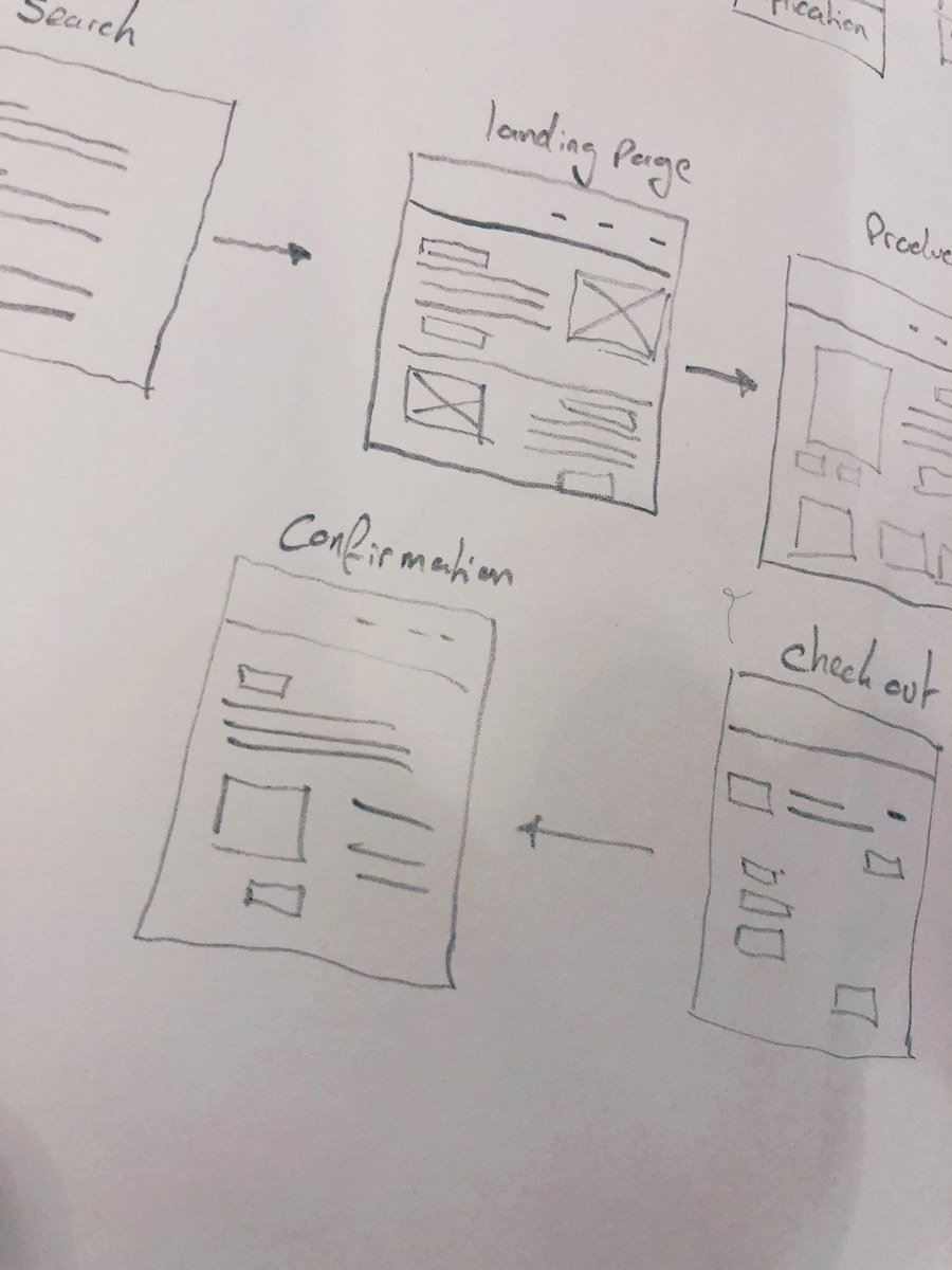
I love starting the wireframes in their simplest form... pencil and paper. Starting with pencil and paper is fast and enables me to make changes quickly. It also means I don't get attached to a particular design just because it took a long time to create.
Using a pencil and paper also allows me to create different variations of the same page quickly - I don't have to go through the process of setting up design documents, I just turn the page and begin sketching the next idea.
To get started, I write out two sets of notes:
A sentence or two about what the purpose of this page is. For example, an 'About' page may be about allowing customers to see the people behind the business.
A list of the pieces of content I want to place on the page. Using the 'About' page example, this could be content like 'our staff', 'how we started' or 'contact us' links.
Once I know the purpose of the page and the content sections I want to place on that page, I start to sketch out a few initial ideas. I try to think of the page's hierarchy, how the user can flow through it, and what actions should be available to allow the user to complete their goals or meet their needs.
Having the user flows in front of you while you start sketching is especially useful. It allows you to understand the mindset of the user, where they are coming from and what the goal of the visit is. Knowing this helps you focus on making it as simple as possible for the user to find what they are looking for and to provide complementary information to assist them on their journey.
Key points to keep in mind while sketching the layout:
What is the purpose of the page?
Which users are likely to see this page and what are their goals?
What content is needed on the page?
Where does this page need to lead and how can I make it easy for users to get to the next step in their journey?
Once the aims, users and content are clear in my mind, I start to draft low-fidelity sketches. At the start, the wireframes are a collection of boxes and labels; they don't have the 'wow' effect of visual designs, but they play an important role in developing the whole experience. The sketches aim to create the correct page hierarchies and focus on making the page flow smoothly for the user.
While creating options for the page layouts, I ask myself:
Does the content make sense in the order that I'm putting it?
Are the CTAs in a place where the user will see and understand them?
Does the accompanying media add value to the section in a way that makes sense?
At this stage, I'm not focusing on how the visual design will look, it's more about getting a feel for how the content will sit and flow on the page.
After a few design ideas, I pick one I like and start to work it into something with a bit more detail. I begin to think about how the content will be positioned, what types of images or videos, and what interactions the page will have.
Next, It's Time To Use Sketch
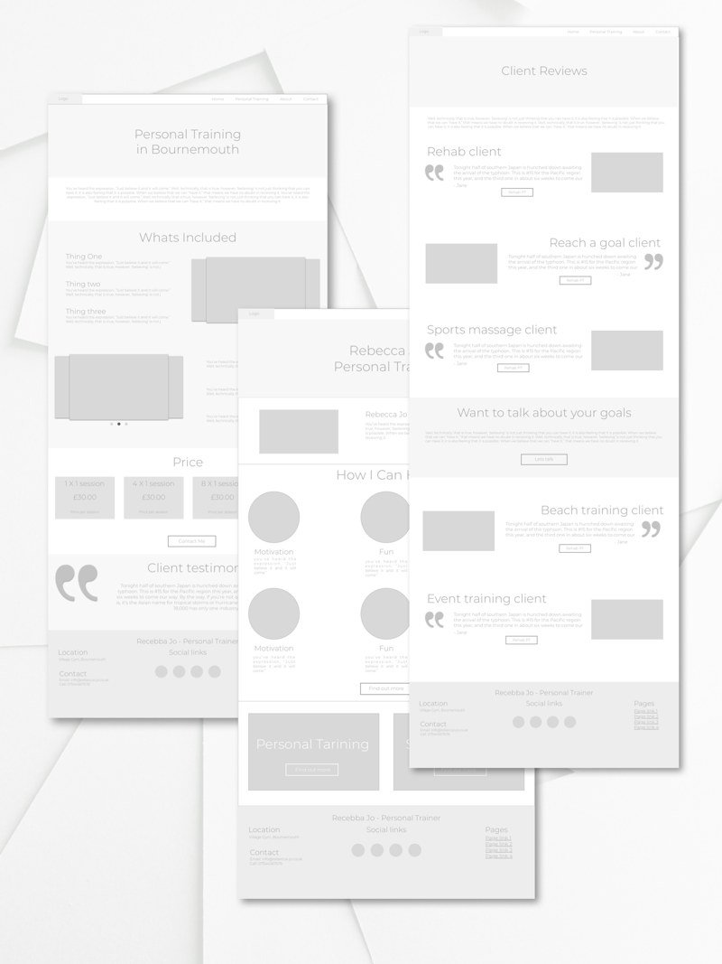
Once I have a rough sketch that I like and I'm happy with how the content on the page flows, I fire up Sketch. For this particular project, I used Sketch because it integrates with InVision really well. I wanted to run tests on the wireframes once they were complete and I've loved how easy it is to get feedback using InVision.
When I start to design in Sketch, I try and use as much real content as possible. Avoiding lorem ipsum where possible helps to give the person reviewing the wireframe more context around what they are looking at. I also find that using real content helps get better feedback when running tests in InVision. It lets the user get a real sense of what the page is about and can help you capture early feedback about your language. It can be valuable feedback about the content you plan on using.
Once the wireframes are done in Sketch, and I'm happy with the layout I start to import them into Invision. This process is super easy with the Canvas plugin; here’s how it works:
Finish your wireframe/ design in Sketch
Click the Sync button in the Canvas plugin (link)
If you haven't yet logged in to InVision, it will prompt you to do so
Select the project you want to import the wireframes too
Click Sync
Now when you log into InVision, you can see each artboard as its own page. The wireframes are nearly ready for the initial user testing. In the next post of this series, I'll talk about getting the wireframes set up for testing within InVision and how it enables incredible real-time feedback.